Kimi Note

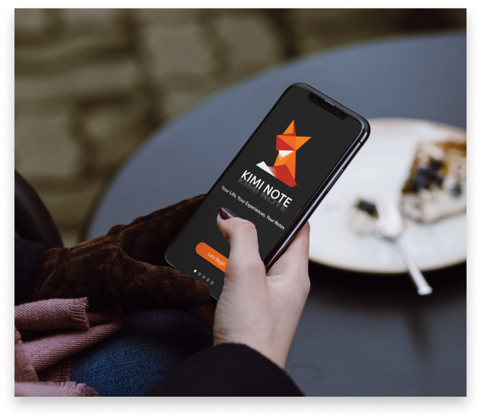
A note-taking app that prioritizes organization and efficiency to help make remembering throughout your daily life that much easier
View prototype

Design Roles

Ux Design
Ux Researcher
Information Architect
Visual Design
Brand & Identity

Design Deliverables

Personas
User Stories
Site Map
Sketches
Wire-Frames
User Testing
High Fidelity Mockup

Specifications

Duration
1 Month

Tools & Software
Figma
Adobe Illustrator
Overview
The problem
Note-takers needed a way to be able to quickly create, and organize notes in their day to day life
  • Design a note taking app, geared toward efficiency and organization
  • Establish a brand
“As a daily note taker, I want to be able to quickly create notes so I can easily stay organized.”
User Research
Users & Audience
  • Day to day note takers
  • Professional note takers (Jounalists)
When designing an app like this you will end up having a pretty broad user audience, however, I decided to focus on those with efficiency in mind as that is the main goal of the note app. Meet April and David our Personas for this app.
User Surveys
While having some personas is a great way to gain empathy for users, I find the best way to really see how people feel is to just ask the users themselves. So I sent out a survey to a local Facebook group as well as to a student group on slack and got some valuable data back.
When asking users about the features they found most important in a note taking app, a few key things kept coming into play, the first being "a way to search notes" and the second being "lists"
The follow up question asked users how they used their notes, and most aligned with what was mentioned above, they used them for lists, school more than work, and to remember things for later.

One thing I wasn't expecting was just how many people use their notes for blogging and journaling.
User Stories
With our audience in mind, I created a few user stories to begin to get an idea for how and when users would be using our note app. Here are a few listed below.
"As an unorganized note taker, I want a way to search by keywords so I can find what I’m looking for quickly"
"As someone who shops a lot, I want a way to create grocery lists quickly and be able to check off items I’ve added to my cart"
Defining the app
Site Map
With a good understanding of the user’s current interaction with note apps, I got to work mapping out a site map, this would be the base for building the structure to our note taking app
Wireframes & Sketches
The wireframe process was straightforward thanks to the sitemap from earlier I was able to quickly get to work sketching without having to worry about content. Once I found some winning designs I took them into Figma and polished them up into wireframes
Creating a style
With a solid idea of the layout and feel we worked on creating a brand for the app itself. The logo ended up being my north star that set the foundation for the rest of the stylization.

When I first sat down and began sketching ideas for the logo, I used word association to figure out what to sketch, however after about 30 minutes of staring at a blank canvas sketching different notebooks quills etc. I took a break and went to dinner.

I felt somewhat defeated as I wasn't happy with any of the designs and it was there at my table as I stared at the folded napkin encasing my silverware that it hit me! I should do some sort of origami design!
It came down to these two foxes which you can see in the top left. I sent a A vs B test out to my Instagram followers and while it was close 65% of people preferred design B over A
Usability Testing
Final prototype
Click here to view the prototype
Usability testing
With the final look and feel for the app, it was time to put it to the test, I used a website called Maze.design for my testing as it allowed me to create a path for users to take, and then send the test out remotely, which given the current world atmosphere was the perfect way to test Kimi Note, here are some of the results;
One key thing we noticed was that users seemed to be failing the second task which was to navigate to the notebooks screen. Looking back I noticed this could be an issue with our onboarding which I had initially not put much thought into.
Above is the original onboarding process, as you can see on the 3rd screen it addresses the quick note buttons but it does not show users how to get to the notebook section.
The updated onboarding fixes this issue by directing the users attention to the areas where the notebooks are kept. This can be seen in the latest prototype as well.
Accessibility
One of the most important parts in any design process is the Accessibility, when designing Kimi note we wanted an easy on the eyes look to the app. With this however comes the risk of having to little contrast, to help keep the app accessible I used a Figma plugin called Able which allowed me to ensure the contrast passed the test.
Another thing we kept in mind was text size, we made sure all main fonts were at least 18 pt, as its a very easy to read size.
Outcomes & lessons learned
Outcomes
  • Designed an onboarding solution for Kimi Note
  • Achieved a working product that aims to help users efficiently take notes from their phones
  • Created a solid branding for Kimi Note
Lessons Learned
  • One of the key things I learned here was the importance of onboarding. Users had no problem quickly creating a note or using the other quick note buttons, however without the onboarding to guide them to the submenu some missed it completely.
Recommendations for Pocket Route 2.0
  • Ability to change fonts, everybody has their own preferences. This would also be great to help those who might have a sight disability and need to increase the font size for themselves.
  • For iPhone users, possible widget integration would be good as well