Yeti Skins

An E-commerce website designed for accessibility, that fits the needs of the consumer and establishes a brand for the company.
View prototype

Design Roles

UX Design
Visual Design
Brand & Identity

Design Deliverables

Personas
User Stories & Flows
Sketches
Wire-Frames
User Testing
Style Sheet

Specifications

Duration
1 week design sprint

Tools & Software
Figma
Adobe Illustrator
Overview
The problem
Yeti Skins currently has no way to sell their product online and has yet to start establishing themselves as a brand. The challenge was creating an accessible website that would fit the needs of the consumer.
  • Can't sell products
  • No branding established
  • Need to fit the needs of the consumer
“How might we structure an intuitive E-commerce solution that makes it easy to sell and order products?“
The Process
For this project, I decided to utilize the design sprint method. Which has you pick a focus target, or problem, on the first day and then spend the next 5 days creating a solution for that problem and testing it with a target audience to see if what you spent the past week working on actually works as a viable solution. The design sprint is used by google and is a great way to rapidly iterate on designs.
Day 1
Choosing a target
Before I began designing a website for the company I had to pick a target to focus on. This would help keep the scope of the project reasonable and prevent me from going down the rabbit hole of wanting to add every bell and whistle imaginable as the project went on. For this I used Figma to act as a digital whiteboard of sorts and created a list of as many problems as I could.
A list of sticky notes showing the HMW statements
After mapping out all our problems right below them we changed the statement into what we call a HMW (how might we) statement. This helps us change the mindset from "this is a problem." To "how might we solve this problem?"

We decided that the biggest focus for this sprint would be;

"How might we structure an intuitive E-commerce solution that makes it easy to sell and order products?"
Keeping the user in mind
Throughout the process, we wanted to make sure we kept the users’ needs in check. To help us do this we mapped out an empathy map as well as made a few user journey maps to build a sense of empathy with the people who would be using the website.
Picking our MVP
To fulfill customers needs, we decided the key MVP (Minimal Viable Product) for this website would be to have;
  • Homepage
  • Various products to browse
  • Product view page
  • Cart screen
  • Checkout screen
  • Easy to navigate
Day 2
Sketching it out
With the MVP’s established I got to work sketching out different possibilities for design solutions for the website. One of the bigger decisions we made here was whether to have the homepage be mainly filled up by the product images or to have it broken up into easier bite-sized chunks. You can see this from the left and right images above.

Since we wanted to keep accessibility in mind throughout the design we opted to go with the "Info maniac" design as the "loud and proud" version would make it difficult to have alt text that would allow for those with vision disabilities to be able to browse the website.
Day 3
Wireframes
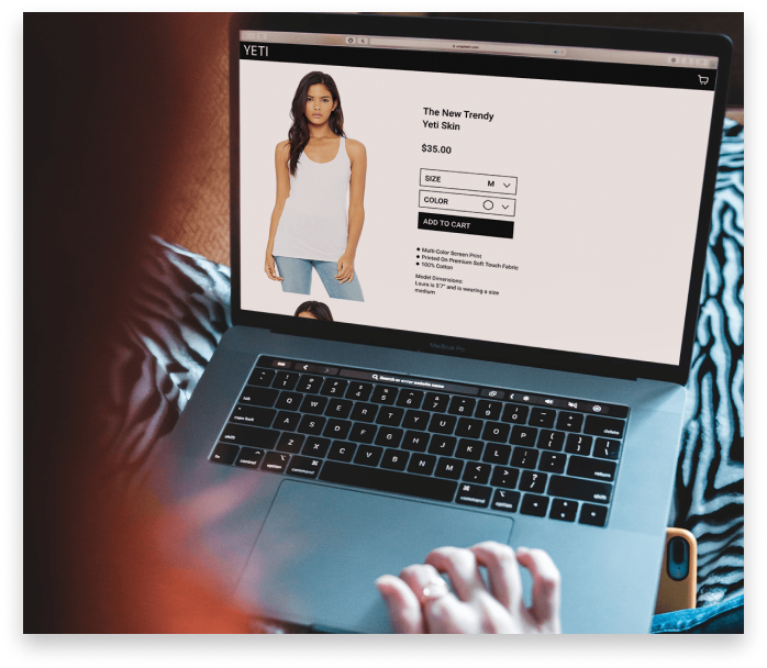
The sketches were brought into the design program Figma and turned into wireframes, also known as the skeleton for a website. A few corrections were made during this phase mainly revolving around re-sizing elements. The top page header, for example, and the shopping cart icon was way too big! The product view page was also adjusted to feel less big on the screen. Thus the saying bigger is better was debunked and we all went home, feeling successful.
Creating a style
I asked the client if he would be willing to put together a mood board of different designs that he liked and based on those I would begin to work on a style for the website.
He quickly put together a Pinterest board showcasing what he would like to base the website style off of. A few key things that I took from the mood board were; Bold lettering, nature, trees, and monochromatic coloring.
After presenting the client with different iterations as seen above, he settled on a mix between the 2nd and 3rd. The typeface that was used on the second he liked, but decided he loved the all black and white aesthetic of the 3rd iteration. With the clients approval I got to work on finalizing the style guide for the website.
Day 4
Final prototype
Click here to view the prototype
Accessibility
After 3 days of sketching, planning, and talking to the client, the final prototype had been created and was ready for usability testing. However before pushing it out to users we took one good long hard step back and looked at it with eagle eyes to spot any errors that we might have missed. While looking at it there was a few accessibility issues that were found and addressed below.
Before & After
The biggest key changes that were adjusted for accessibility was making sure there was proper alt text. as well as creating a greater contrast for those who might have problems with their vision. Labeling the colors also helps those who might be color blind to be able to know what color it actually is that they are picking.
Day 5
Usability testing
It was the dawn of the final day! The product was looking nice, and we had come along way since day one. However this meant it was time for the scariest part of any UX project, the usability test.
Need a break from reading? Click here to watch a fun video related to usability testing
Key discoveries
The first discovery that was made revolved around the size and color chart. The clickable area that the user would have to use to get the drop-down menu to appear is represented by the red box. After performing testing we noticed users would always click on the box, and not necessarily the arrow in the box. With this info we changed the clickable area to be the whole box making it much easier to click as shown by the second image.
The next change that was made was done on the same screen. This change revolved around where the user needed to place their cursor to be able to scroll through different images. Originally you had to be hovered over the image to get it to scroll, however after the tests we noticed most would attempt to scroll just about everywhere on the screen so we adjusted the scroll box to fit the screen as seen on the right.
The final, and probably the biggest change that was made had to do with the user flow going from the product screen, to the checkout screen. During the test one user noted that the process felt a little abrupt going from page to page to page. To help ease the user into the checkout screen we decided to opt for an overlay that would appear after the user clicks add to cart, giving them the feedback that they need to know it worked, but also not making them commit to the next page in case they would like to quickly go back and browse. Before marking this as the best solution we would like to do more AB testing to find out what others would think.
Outcomes & lessons learned
Outcomes
  • Designed an intuitive and easy to use website for consumers to be able to browse and purchase Yeti Skins products
  • Gained a greater understanding of E-commerce and the usability of E-commerce sites
Lessons Learned
  • One of the key things learned here had to do with Accessibility and the current lack thereof in the E-commerce industry. I found myself falling into potholes that afterward I would realize I was forgetting to keep accessibility in mind. An example would be on the checkout screen where my original design had no alt text anywhere which thankfully was caught later on
  • This was the first design sprint that I’ve ever conducted and so while it took a second to get used to the new system of designing I really enjoy how during the sprint you're able to just focus on a single problem instead of losing sight of things and getting sidetracked.
What’s next for yeti skins 2.0?
  • Admin Tools
  • Recommendations bar
  • Sign up screen (for faster checkouts)
  • Mail list integration
  • Reviews section