Pocket Route

An accessible app
to aid day to day
commuters keep up to
date with their route
View prototype

Design Roles

UX Design
UX Researcher
Information Architect
Visual Designer

Design Deliverables

Personas
User Stories & Flows
Sketches
Wire-Frames
User Testing
Style Sheet

Specifications

Duration
1 Month

Tools & Software
Figma
Adobe Illustrator
Adobe Photoshop
Overview
The problem
Riders were getting frustrated with the current bus system, arrival times were inaccurate and constantly being affected due to;
  • Unexpected traffic
  • Longer stops to assist passengers using wheel chairs
  • Buses being taken out of service for maintenance
  • Breakdowns
“I never know when my bus is going to arrive regardless of what the schedule says.”
User Research
Users & Audience
  • Everyday commuters
  • Occasional bus riders
While the users would primarily be everyday commuters looking to stay up to date on what was going on with their bus, to know if their commute would be affected in any way, we also wanted to make sure the app would be able to benefit those who would ride the bus once or twice a week just to get to different places in the city.
User Surveys
The main survey was sent out to r/samplesize, a subreddit dedicated to research. We set constraints to make sure that those taking the survey had actually used the bus system previously in their life.
Click here to view the survey
One of the key things we found was that Bus arrival time was the most important information people wanted when going from point A to B
Another key piece of info we noticed was that people would associate bus numbers with the numbers on their bus. We later decided to implement this into the app as a quick way for people to correlate what they were looking at on their phone, with what they were looking at in real life.
Personas
With our audience in mind, I created a few Personas to help empathize and gain a greater connection to the users that we were designing for. Meet Darius and Rachel!
Defining the app
User Flows
With a good understanding of the user’s current interaction with the bus system, I created a few user flows to describe the process that users would take when navigating the bus app.
Wireframes & Sketches
The wireframe process was straightforward however many things were reiterated on, after doing some tests to see how the flow would work I decided that the bottom bar that shows “directions, stops, buses” was not needed instead I could provide that info through other parts of the app, this helped avoid overloading the user with too many options to pick from.
Prototyping
The first prototype
The first prototype fixed many usability issues that came up during the wire frame process. Things like lack of text hierarchy as well as unnecessary info. I also played around with a horizontal layout of the app during this prototyping phase which can be seen at the bottom.
Creating a style
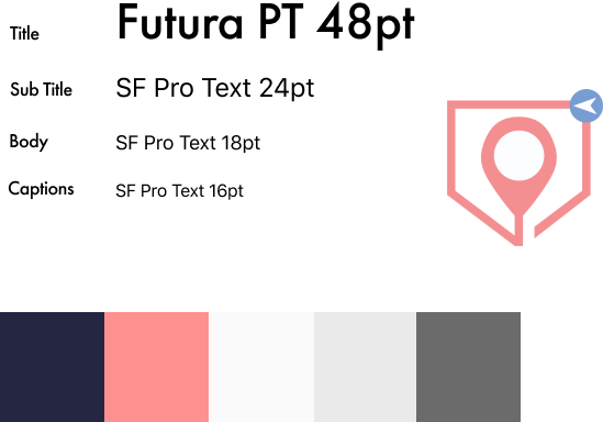
With a solid idea of the layout and feel we worked on creating a brand for the app itself. After sitting down and brainstorming names and then creating logos based on those names we settled on ‘Pocket Route’ the Logo resembling a pocket with a map icon in the middle and a navigation arrow in the top right.
Our style guide
I decided simpler was better for Pocket Route. Since people will rely on this mostly for navigation having too many distracting colors was a no go. So I settled on doing a simple grayscale format with a splash of red and a deep dark blue for certain elements.

The font San Francisco was used because of the familiarity users would have with it making it quick and easy to read.

Usability Testing
Final prototype
Click here to view the prototype
Usability testing
With the final look and feel for the app, it was time to put it to the test, I conducted 3 different usability tests with a range of different users put into 3 user categories. Those categories were.
  • The Tech Savvy: A younger person familiar with tech
  • The Tech newbie: Someone who has little to no experience with tech or with map apps in general
  • The Map Expert: Someone who has extensively used a map app previously before
Some key findings were that most users seemed to have issues navigating to the very last screen where they would get the directions, this might be a hint that we need to make it more apparent that certain icons can be clicked. Another issue was that the back icon wasn’t quite as noticeable as we had originally thought, so we made it a much bolder color.
Outcomes & lessons learned
Outcomes
  • Achieved a working product designed to aid commuters with their day to day bus travel
  • From the research that was conducted we better understand the market for bus apps and what people find helpful in those apps.
Lessons Learned
  • Although we achieved an MVP by the end of the month there is still so much that we’d like to include in the pocket route app. Things like a stat tracker, multiple city integration, a music button, a section dedicated to articles to pass the time on your commute, etc.
  • There were also areas that we had hoped to dive deeper into like the bookmarks section of the app as well as creating the best information hierarchy possible
  • Learned how to design a product from start to finish.
Recommendations for Pocket Route 2.0
  • Conduct A/B testing to find the best visual design direction and layout for pocket route.
  • Create a stronger brand presence by making more imagery that will help make the app more memorable.